PRESSCO — Brand Strategy · Brand Identity · Packaging · Communication
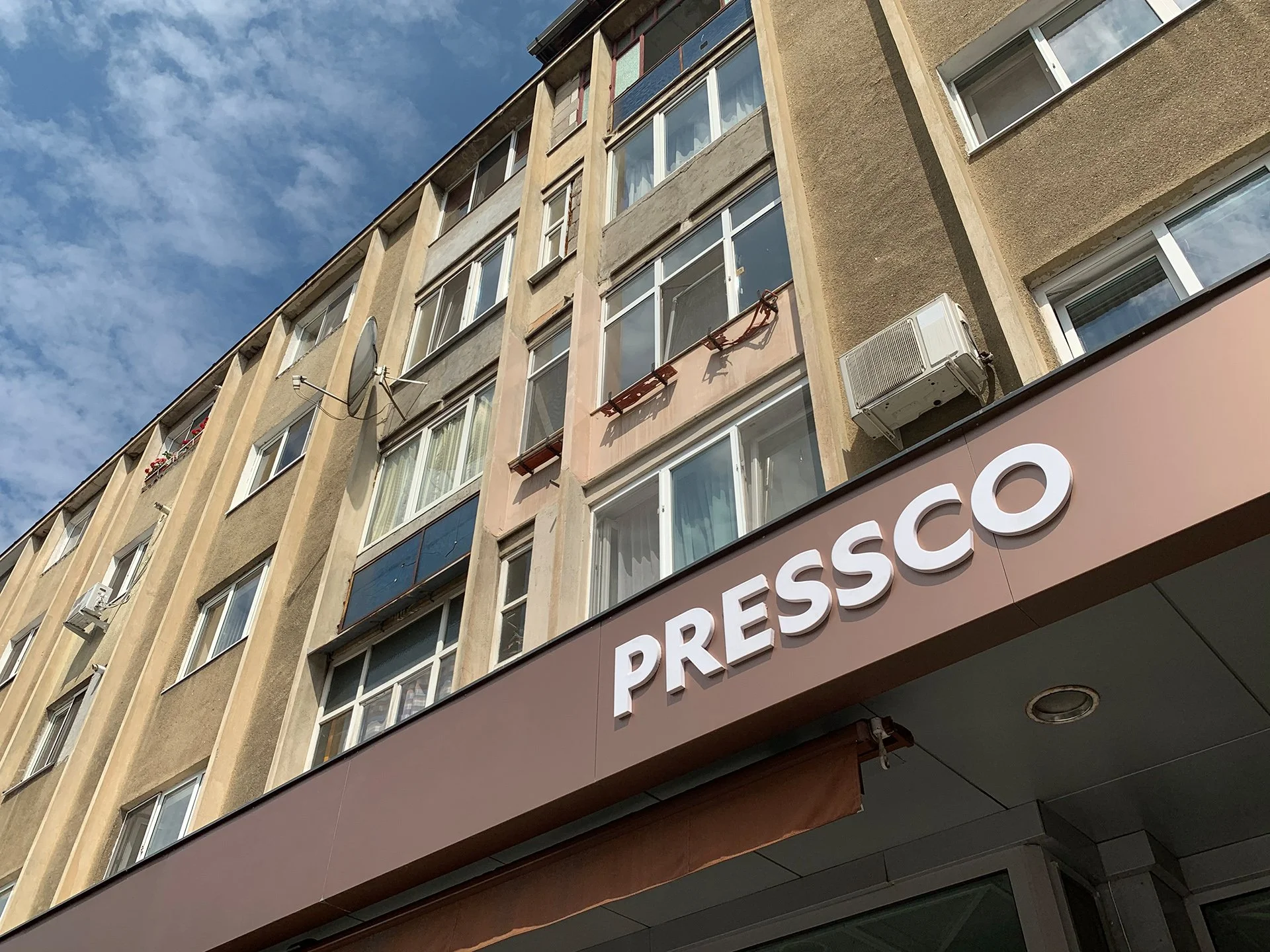
A modern vision in Baia Mare
Pressco is a coffee roastery that sources only single origin coffees growing at high altitudes in remote places around the world. Striving for the aha moments when people realize that there’s more to coffee than they’re used to, this business aims to be open-minded, respectful, transparent, and trusted.
When our friend Răzvan from Alin’s hometown opened Pressco, back in 2014, specialty coffee was just arising in Romania. People called him crazy and didn’t believe he would make it with such a novelty in a small traditional town. His ambition was to prove that you can succeed by having a different vision of quality and service.

Pressco Before
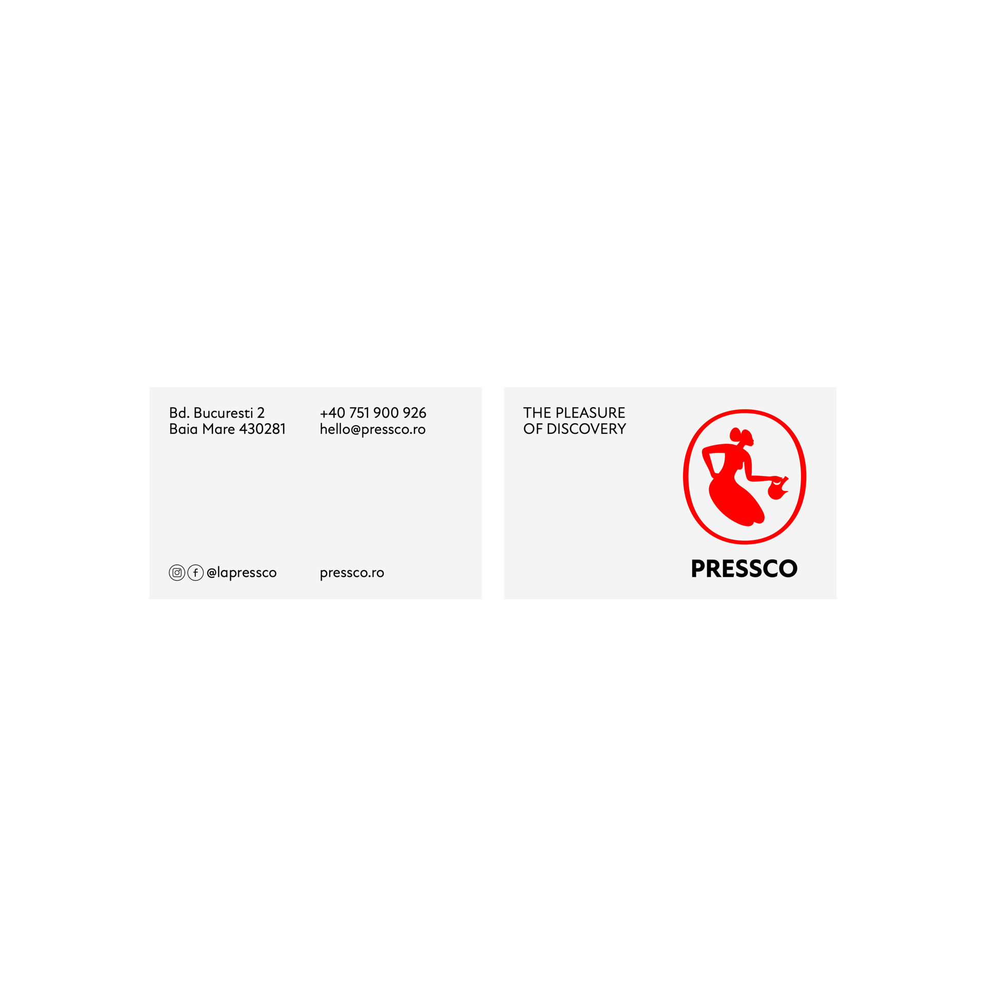
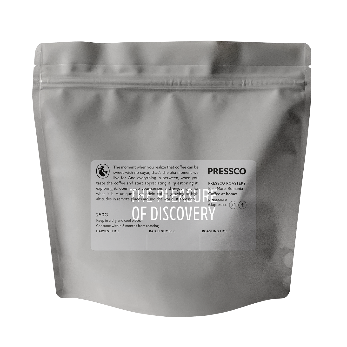
The pleasure of discovery
The rebranding was driven by the decision to start competing at European level. Throughout the process, we would need to reveal and better reflect the reasons why clients should believe in Pressco and employees should be proud of their workplace.
‘The pleasure of discovery’ is what this brand is about. It’s not about coffee, but the whole trip of sourcing, roasting, serving, tasting and enjoying all the different flavors of each origin. The mission we defined for Pressco is to inspire curiosity by creating extraordinary flavor experiences.

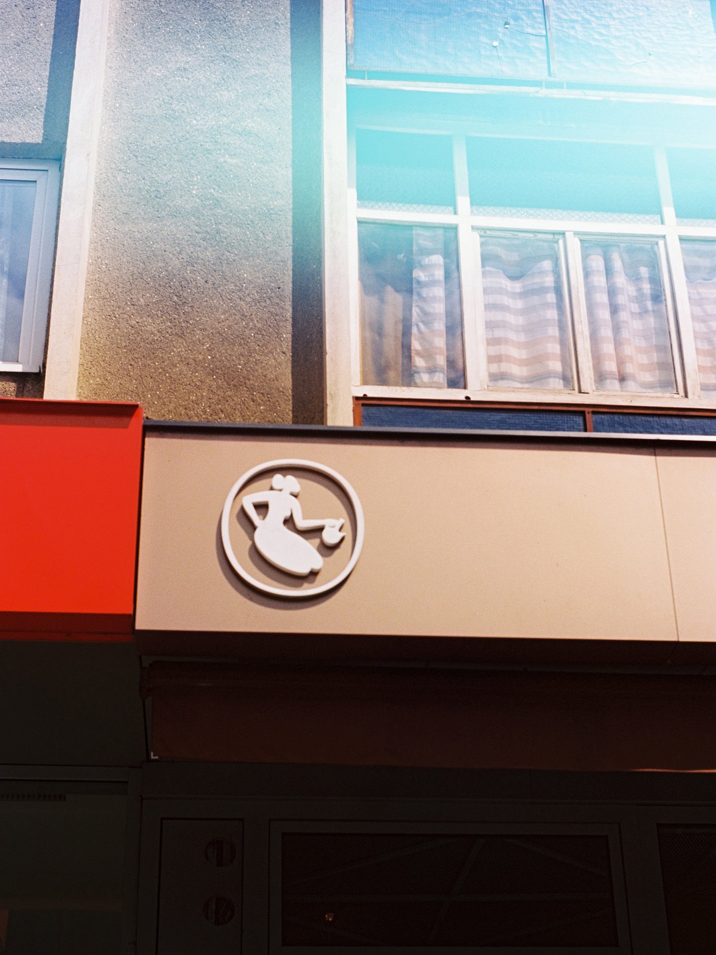
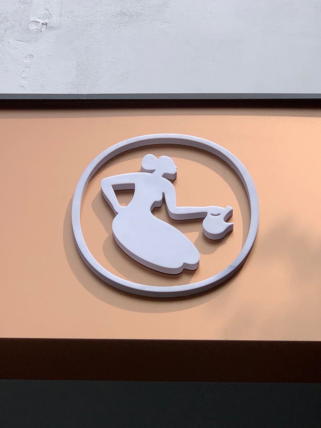
New symbol of hospitality
The initial design requirement was to keep the previous female character and simplify it so that it could work as a logo. We later realized that it wasn’t entirely true to the core and decided to start from scratch.
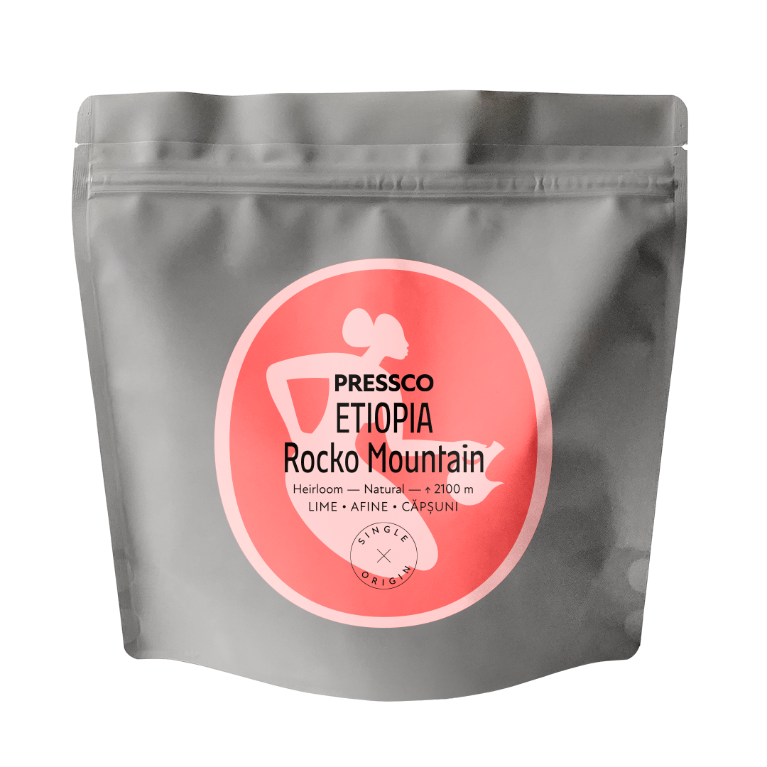
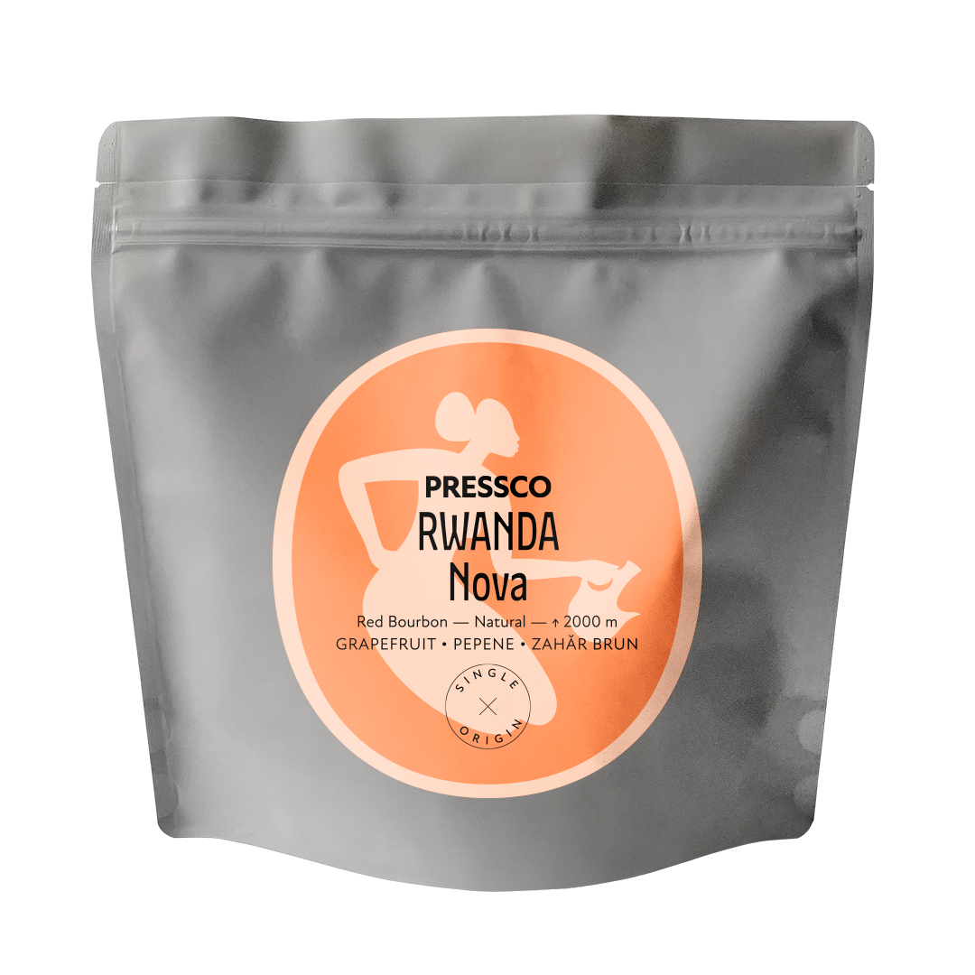
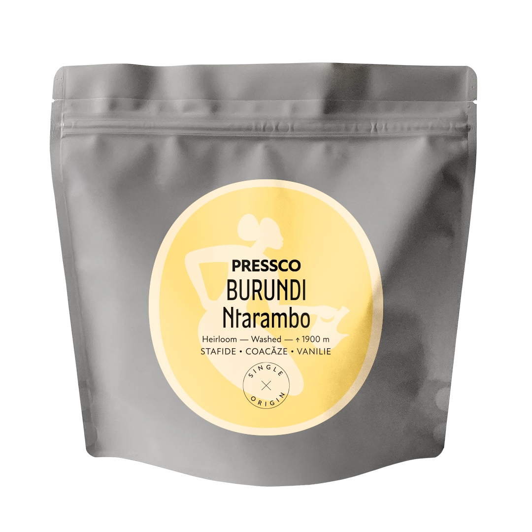
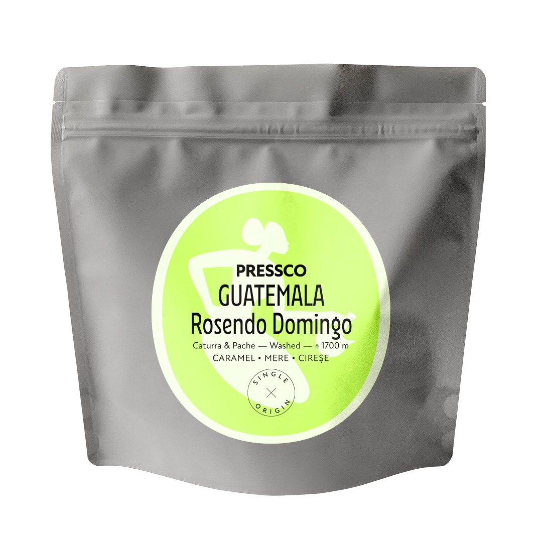
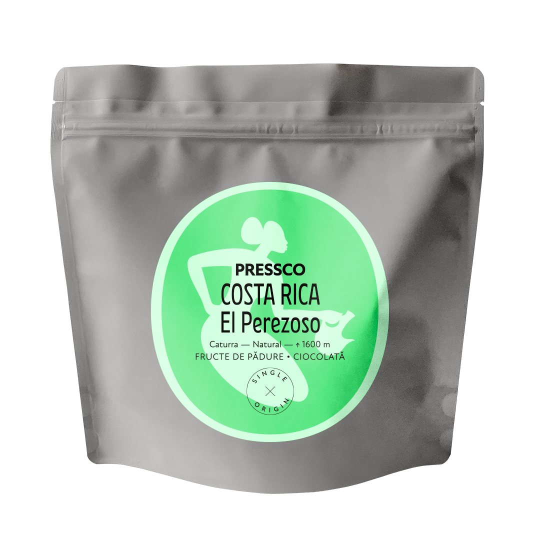
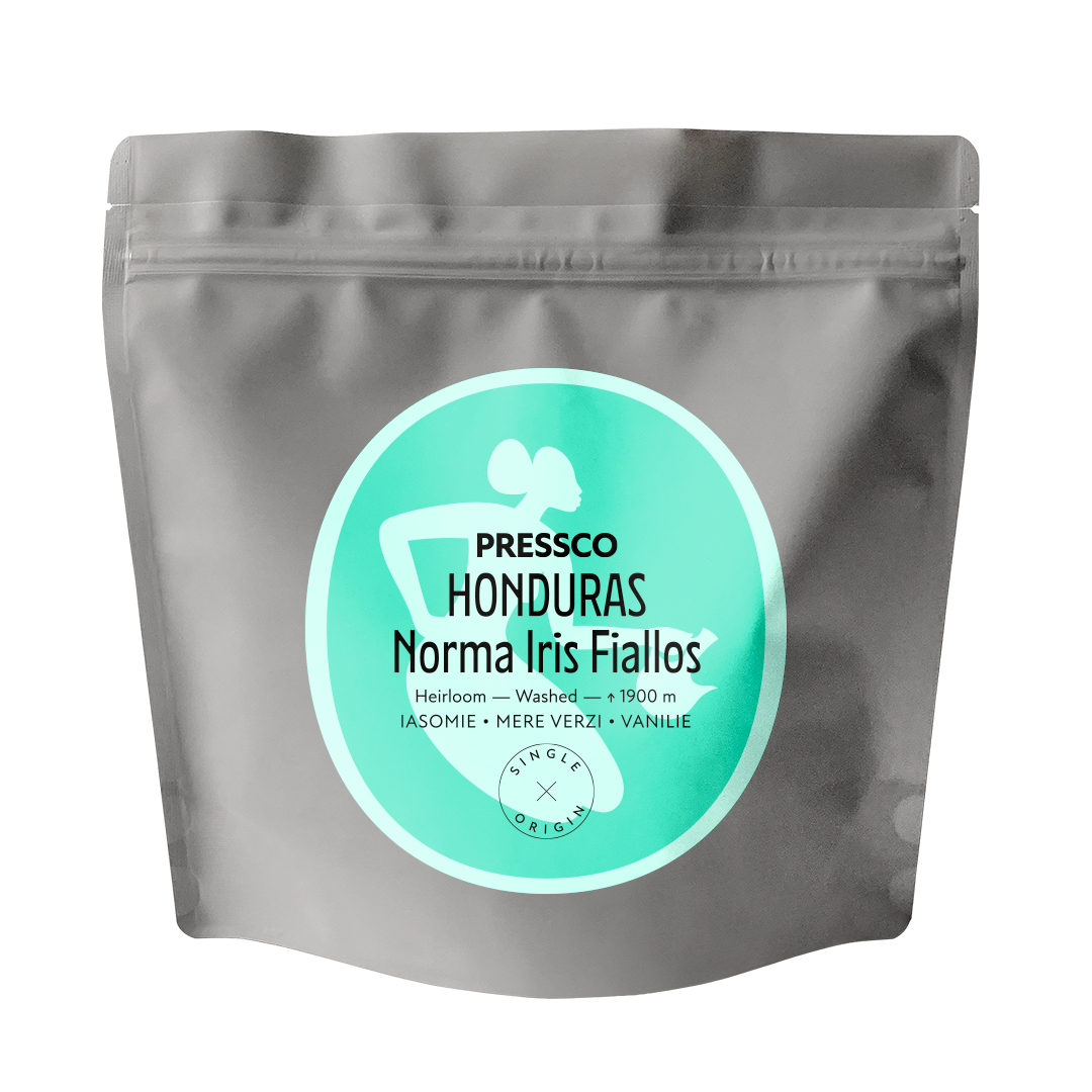
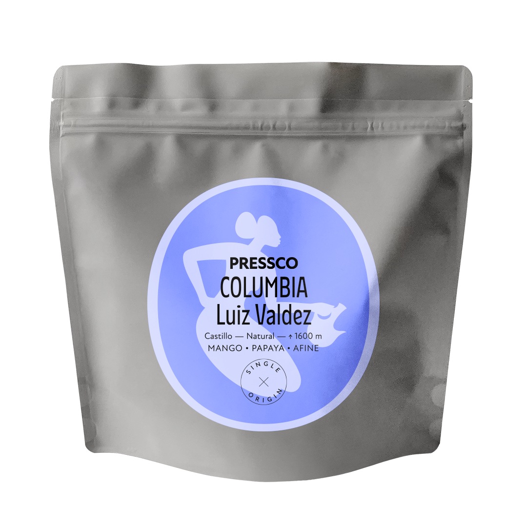
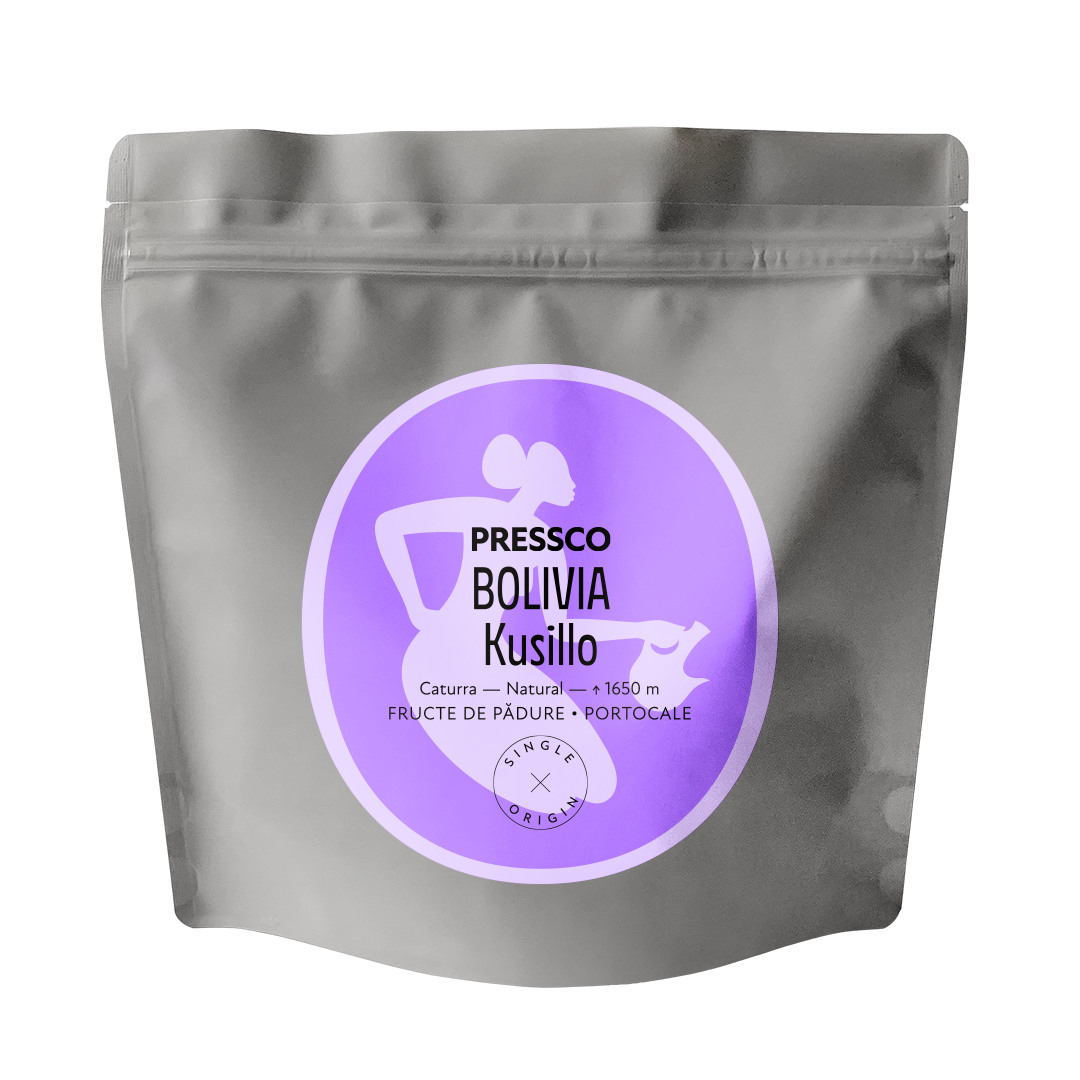
The new identity stars Maya as a symbol of hospitality. The character evokes a continuous search for flavors and origins, the openness expected from the drinker and that basic warmth of coffee cultures. Crafted with details like a confident expression or the clay pot, typical of the Ethiopian coffee ceremony, the illustration is inspired from a prehistoric cave painting in Africa.

New Herman brings an exotic feel as primary typeface, tempered by the comforting New Atten. The labels look sweet with the pastel colour palette, matching the roaster’s intention to bring out the natural sweetness and flavor profile of each origin. They are designed as a template to be easily filled in by the roaster each time a new coffee batch arrives.


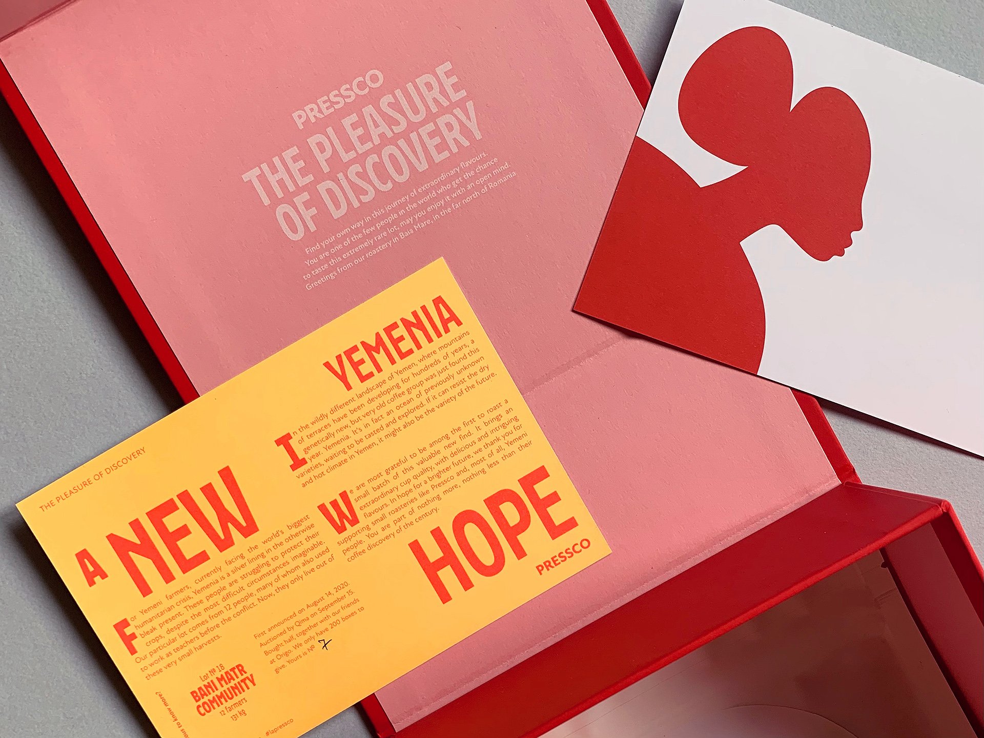
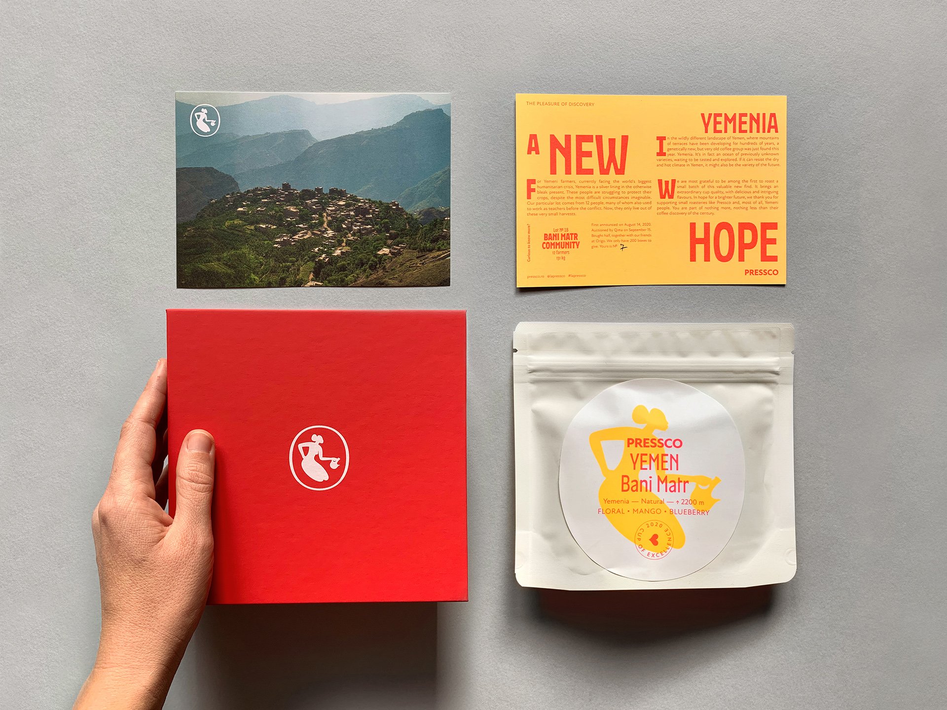
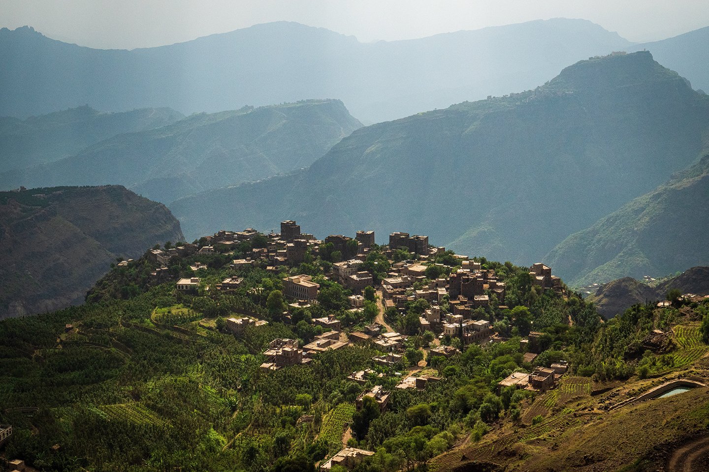
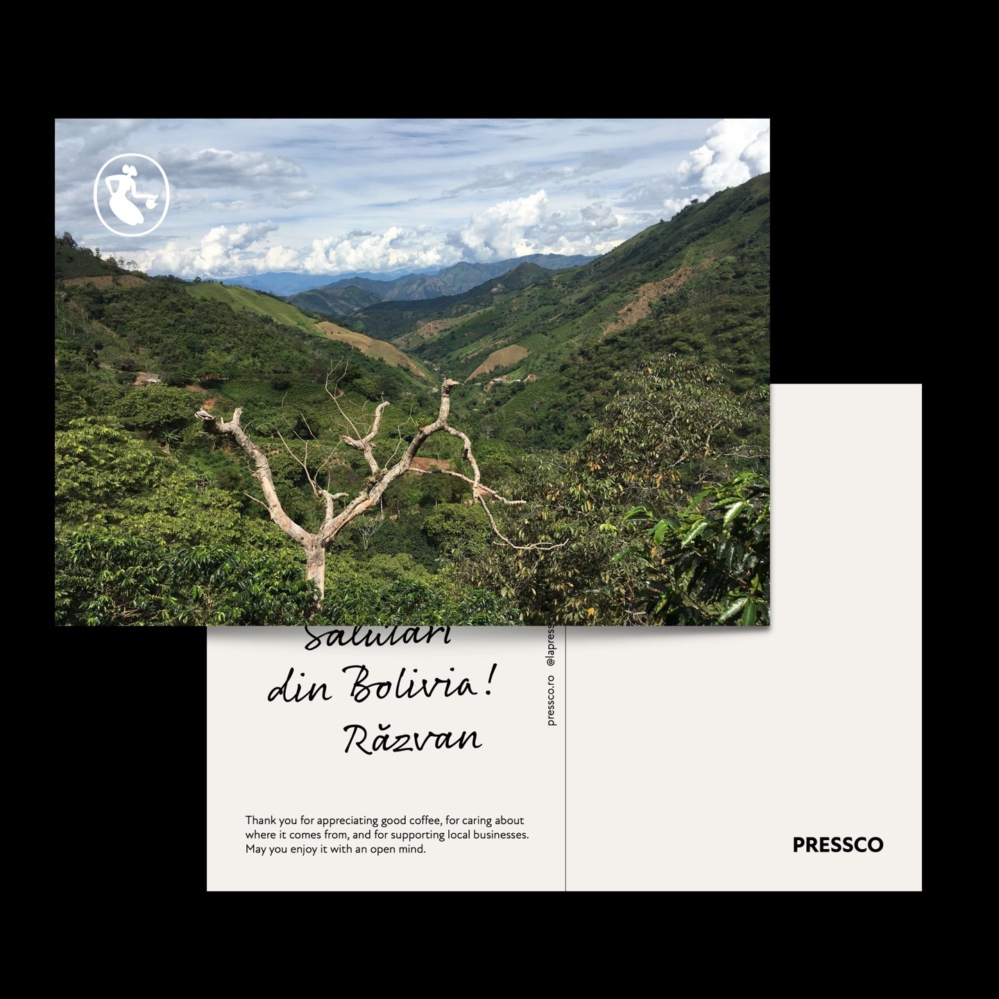
Yemenia, a new hope
We designed a special unboxing experience for an extremely rare lot coming from the community of Bani Matr, Yemen. This coffee variety, Yemenia, has been called ‘the coffee discovery of the century’. And Pressco was one of the first and few roasteries in the world to get a batch of this valuable new find. Limited edition, with only 200 boxes to give.
We wanted this packaging to be a pleasurable and exciting trip for the human receiving it. The delicate branding is intentional, so that you can keep the box and reuse it. The box is dressed in Cordenons Plike Red on the outside, a smooth paper, nice to touch. We combined it with Fedrigoni Woodstock Rosa on the inside. The label and postcard are both printed with Pantone Neon colours, yellow and pink. We chose yellow to represent Yemenia because it’s seen as a new hope for the coffee world.