UPGRADE 100 — Brand Strategy · Brand Identity · Communication · Graphic System · Motion Graphics
The digital transformation brand
Upgrade 100 is one of the largest and most significant digital & tech initiatives in our part of Europe. The brand gained recognition as a digital transformation festival, connecting yearly a growing community of professionals with a diversity of world renown speakers. In 2019, we helped the brand take a leap of faith and change their name and look from the old iCEE.fest, which no longer corresponded to the founder’s vision of growth.
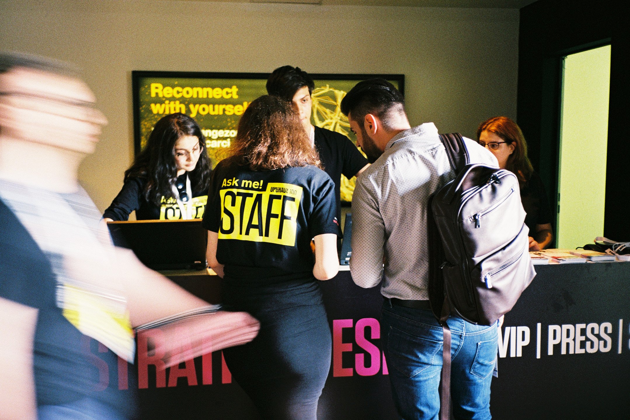
Our role was to bring clarity and character to the brand’s manifestations. We designed a flexible identity which works across a range of touchpoints — the festival, satellite events, the radio show, and all of the brand’s communication, from social media to outdoor. We simplified a complex system by creating rules that leave room for play.
Upgrade in progress
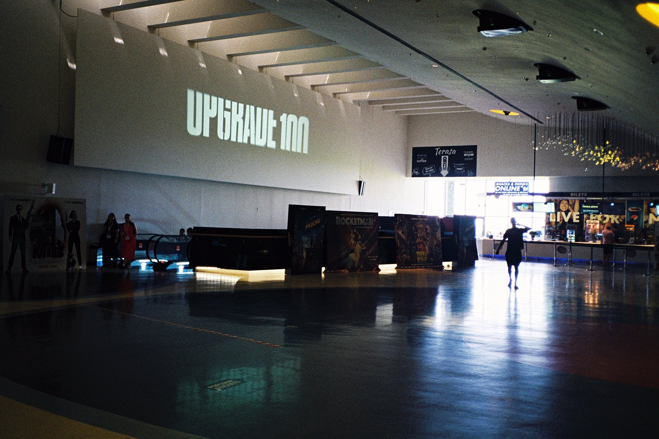
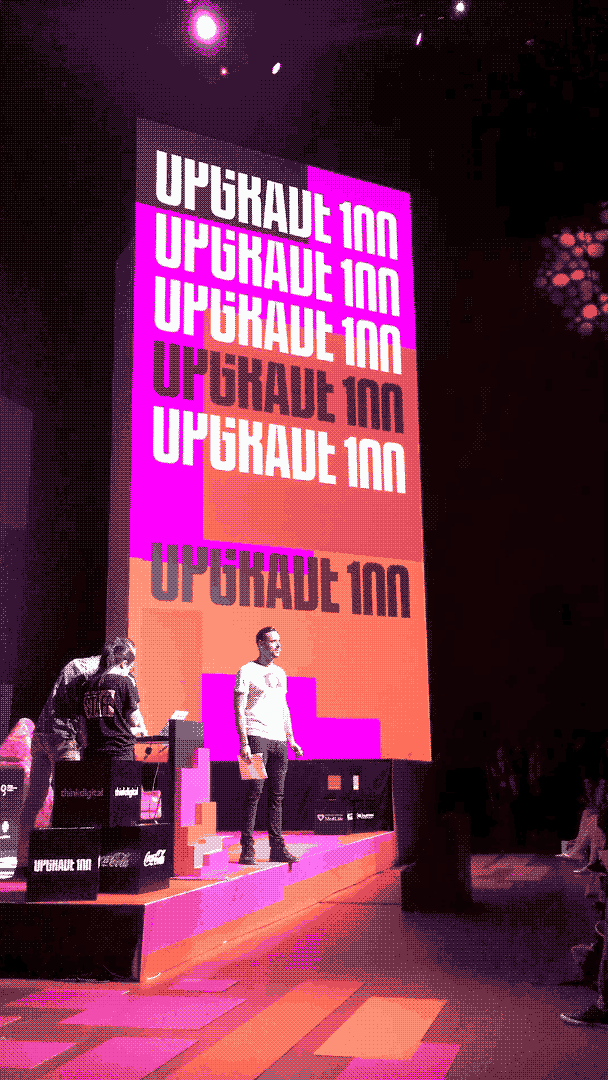
The brand idea is deeply rooted in the tech world. Upgrade 100 was the first identity we imagined in motion from the start. The static logo is a snapshot of a continuously moving logo, one that keeps going up and upgrading itself. We cut the letters to suggest movement, open minds and stir curiosity.
“With a media career spanning 20 years and tens of products launched, I’ve learnt from Hye the actual difference between a logo (plus some graphics to go with it) and branding, building a real brand.”
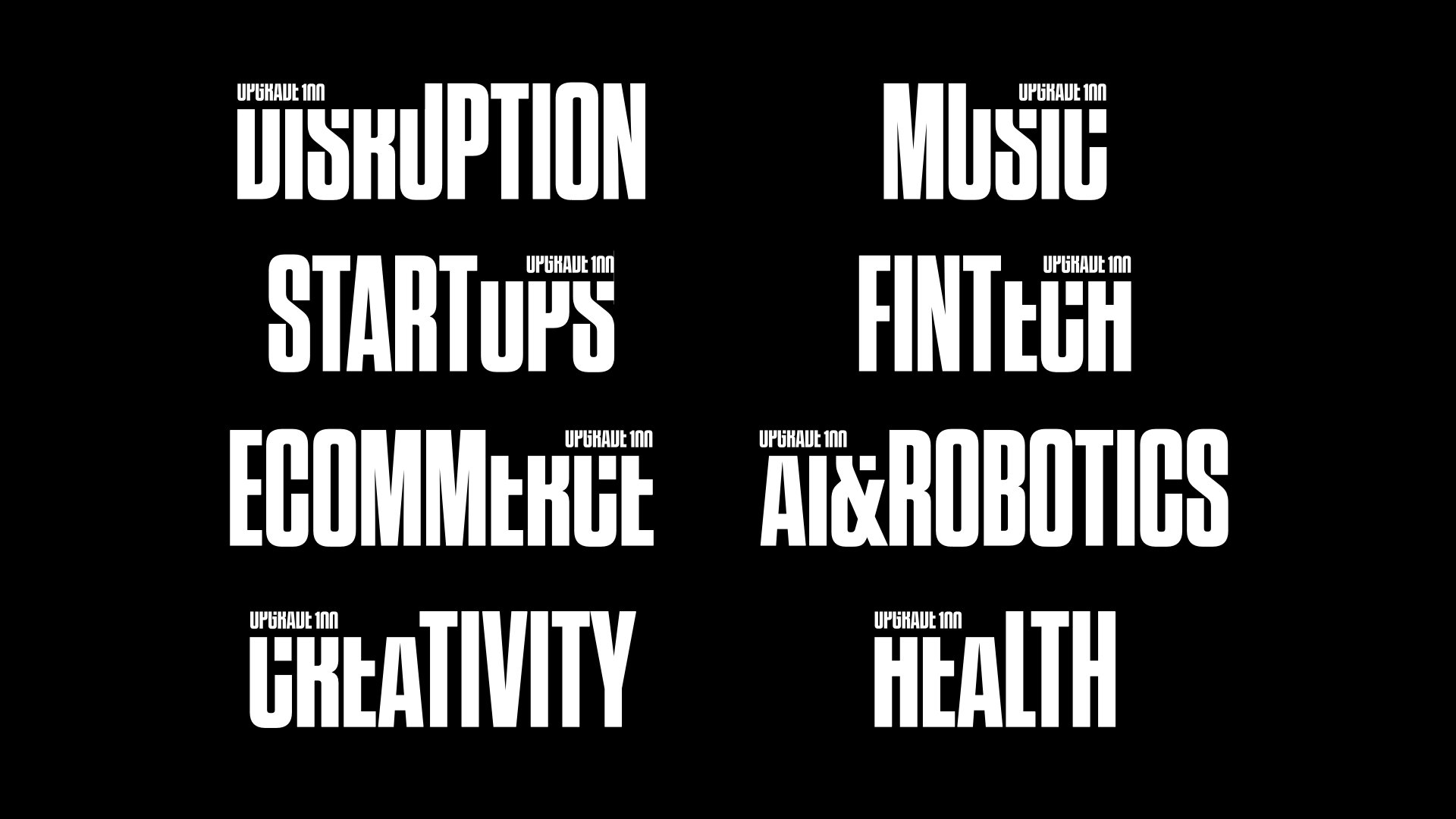
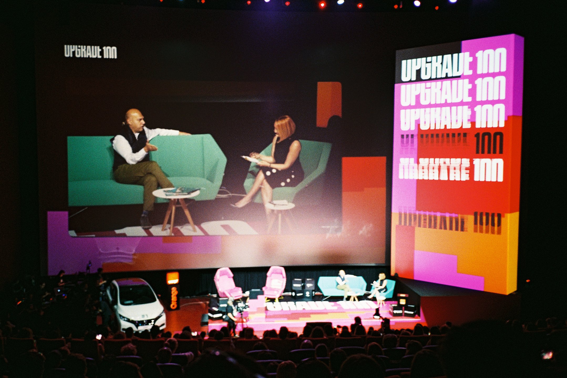
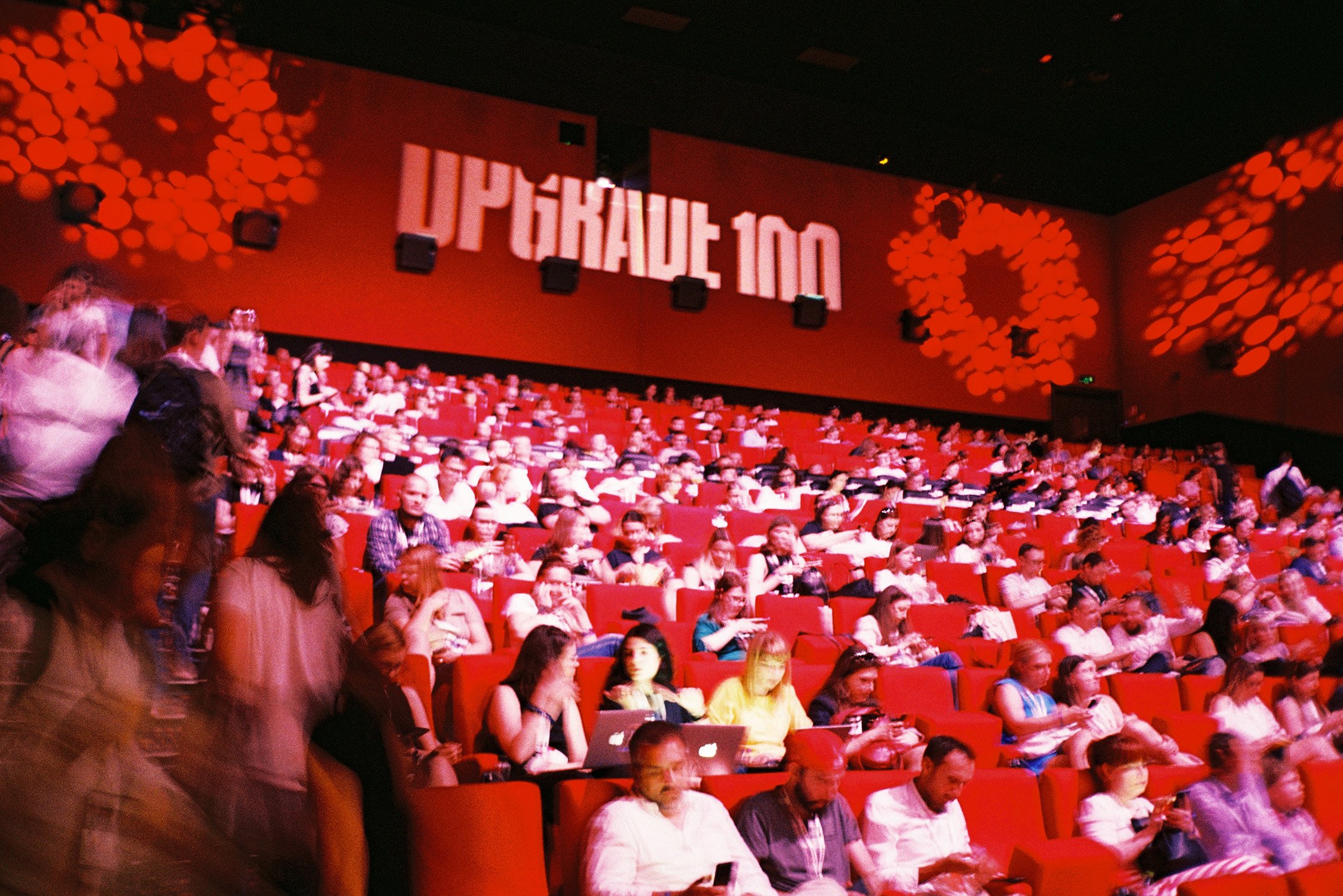
Massive and proud
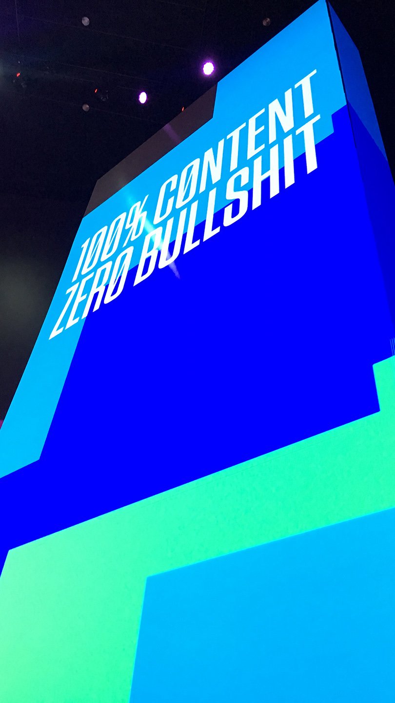
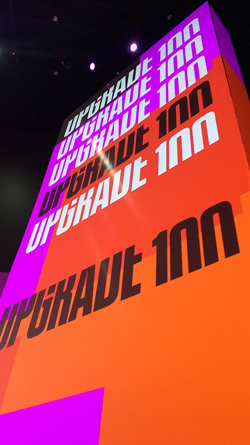
The brand name is written in Tungsten, a well-crafted typeface designed by Hoefler&Co, whom we used to follow and appreciate long before their episode of Abstract on Netflix. We chose Tungsten firstly for its strong impression of height. Secondly, because it stands out in communication, which is essential for an event. Spiekermann’s FF Real complements it well as a more neutral and professional counterpart. Tungsten brings the character, Real is the grounded one.
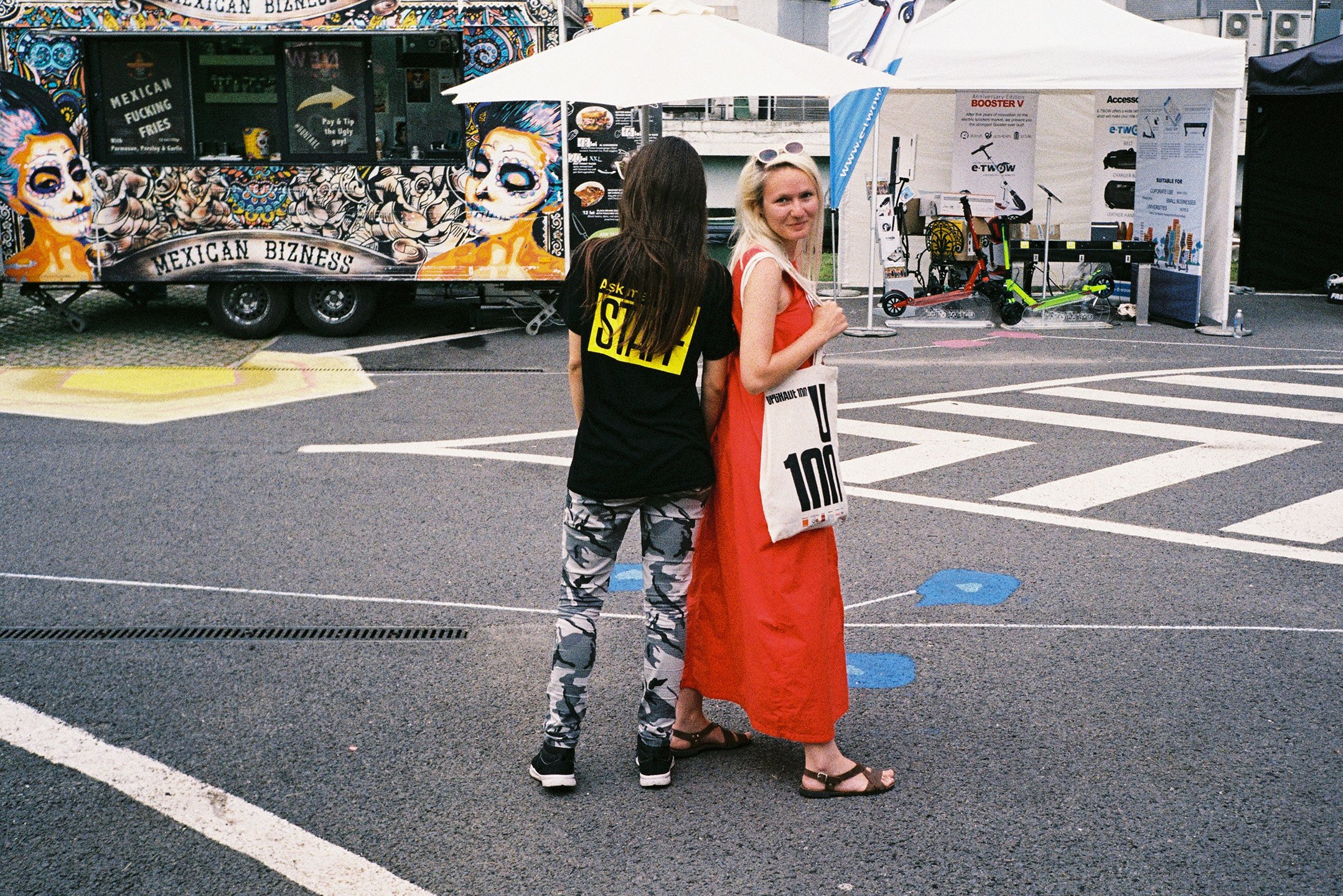
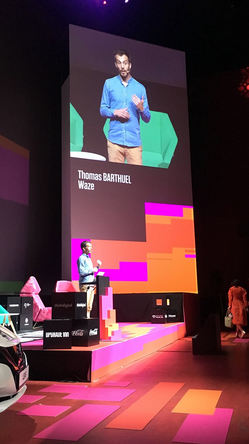
Upgrade 100 is known for the diversity of disciplines it brings together, so we created special lockups of these content streams and the logo, which can be combined with colorful patterns to create compelling visuals. That is enough for a smart, cool and striking identity.
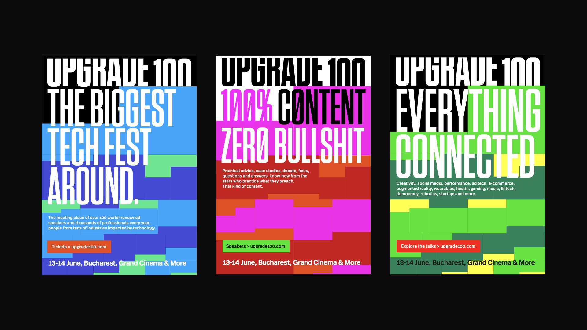
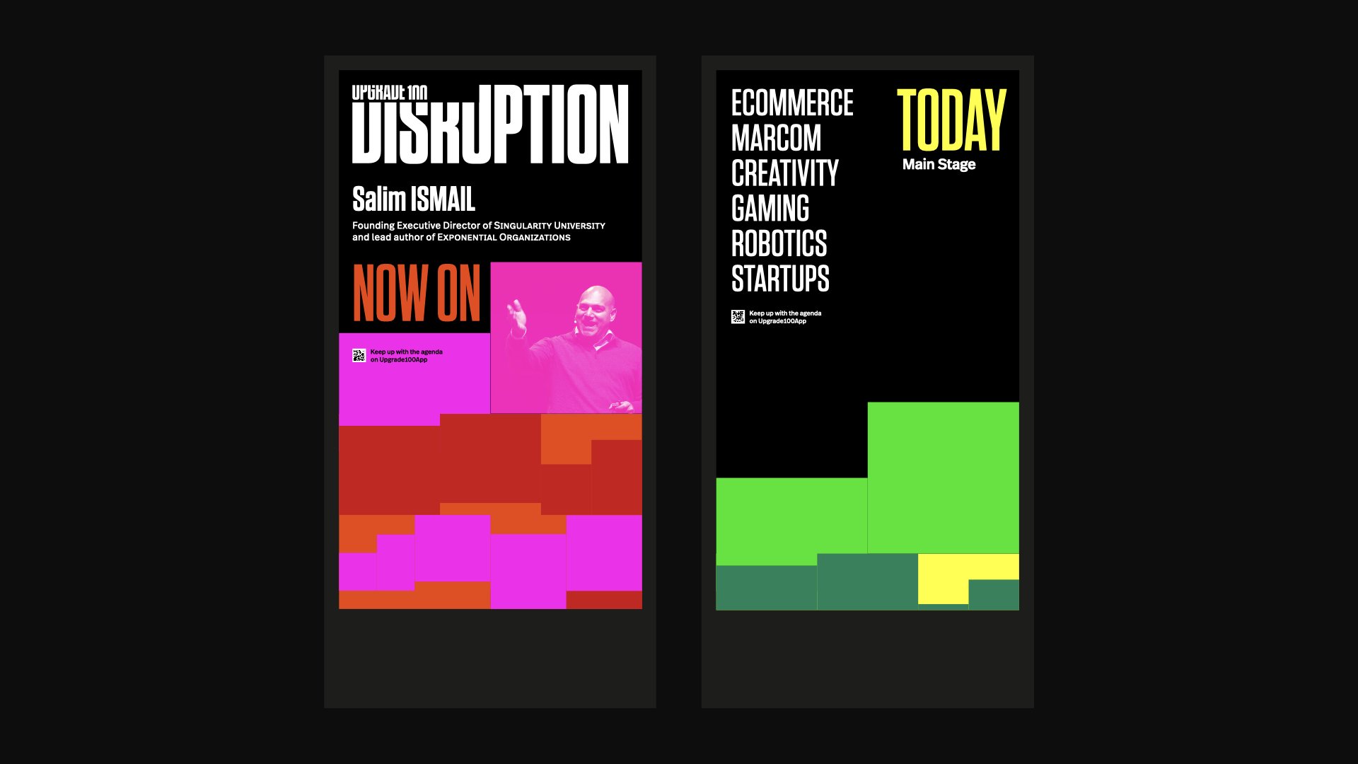
Colors, patterns and repetition
The overall look is futuristic, bold and vibrant. Black backgrounds dominate the white ones, in tune with the dark festival ambience. Patterns add to the liveliness, designed as a moving graphic language that can take endless shapes and evolve in time. They suggest levels, pixels, stairways or interconnected layers. Our intention was to generate an interesting play of colourful elements with a general feeling of going upwards. The amazing animation kit was developed by Rivulet.
The festival project in 2019 was the result of many teams coming together, all of whom we thank for being open to build on the identity principles we defined. A lot of hard work went into all the details that resulted in that electric world-class event. The brand went on and adapted to the times by continuing to provide excellent knowledge online — radio show, podcast, webcast, newsletter, audio-letter and whatever the future may bring.