NARAMZA — Brand Identity · Packaging Design
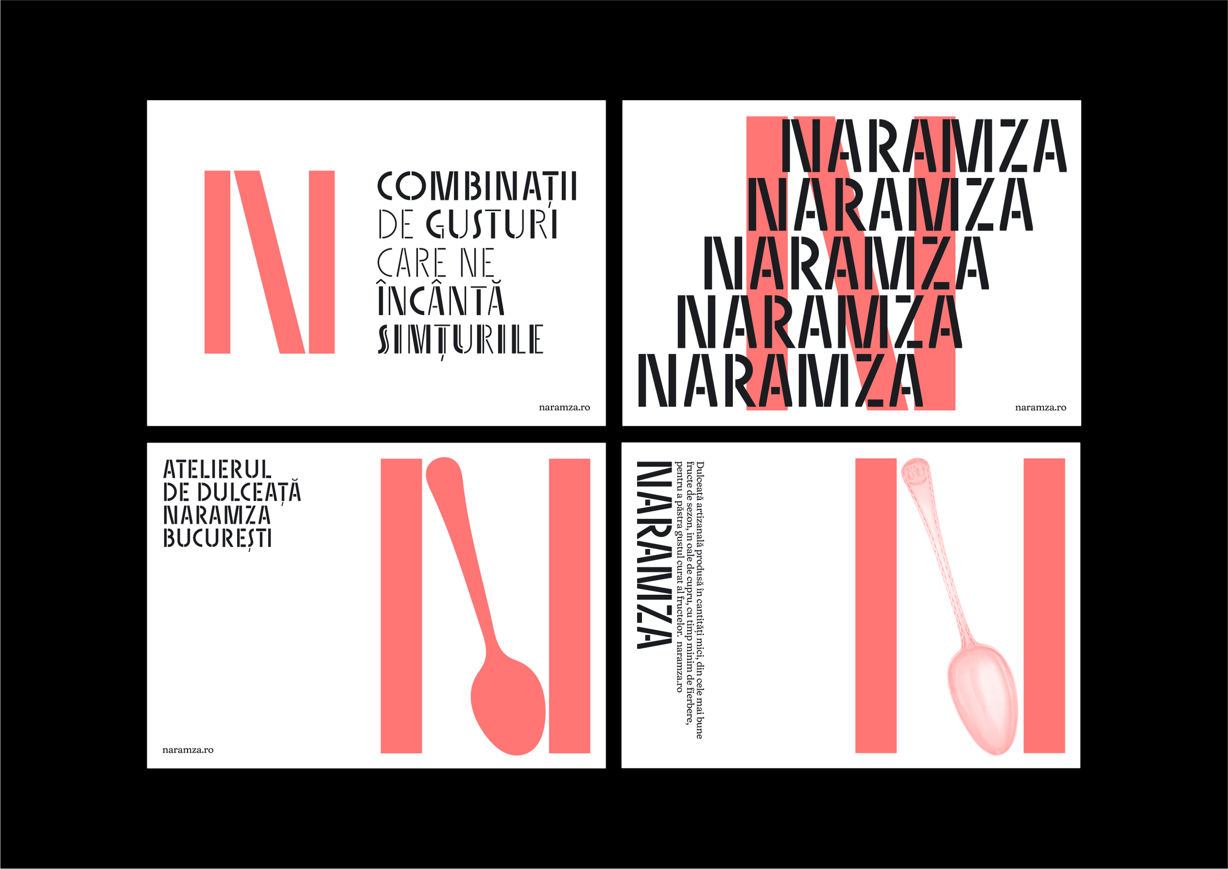
N flavor combinations
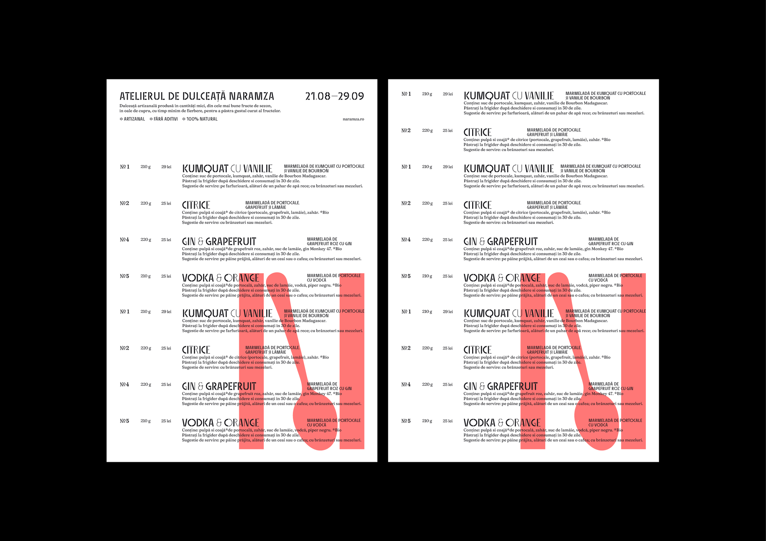
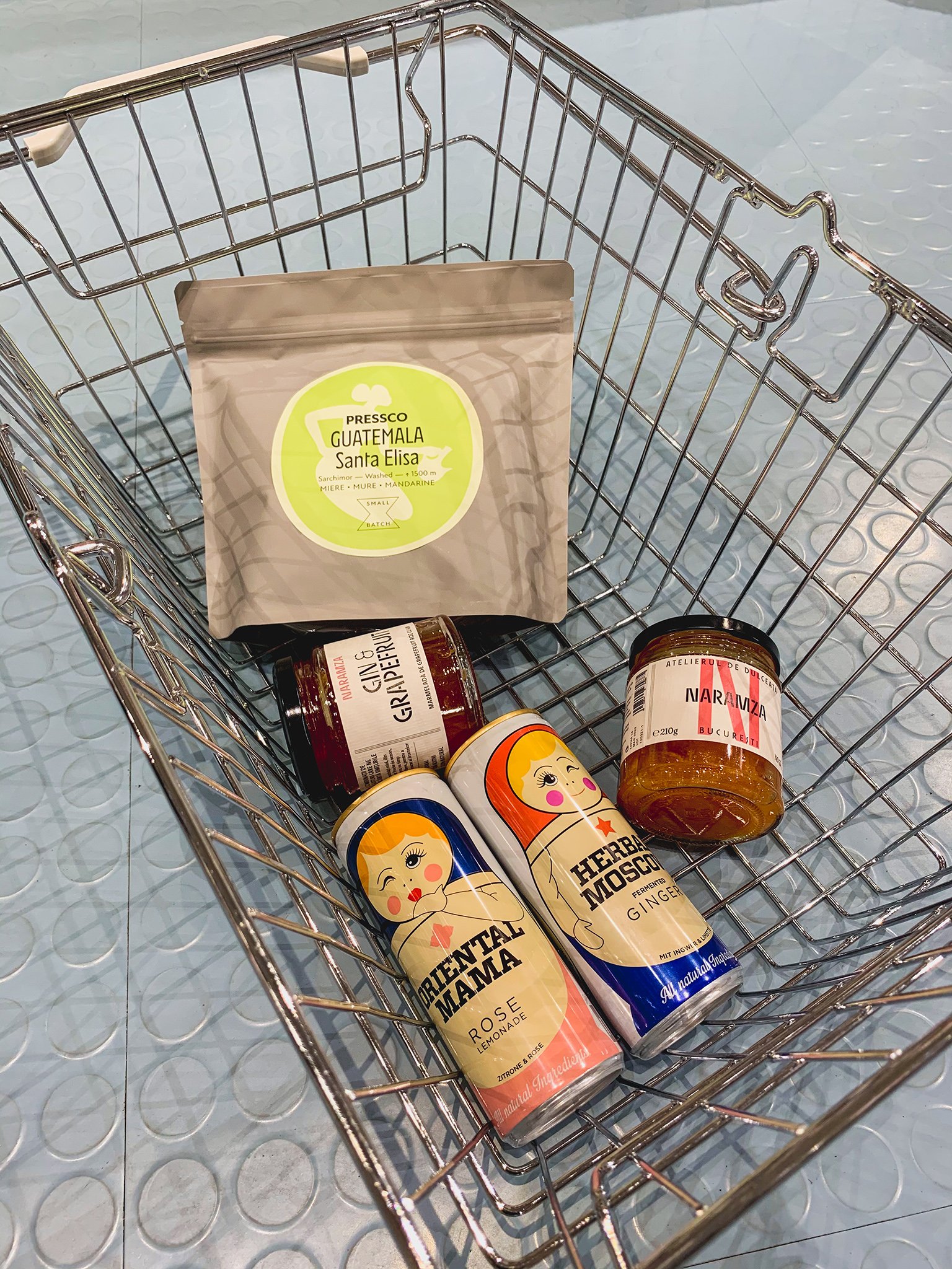
Naramza is a new atelier for artisanal confiture based in Bucharest. When the project was introduced to us, the first thing we liked was the name Naramza, which is an archaic word for the orange fruit. Then, we received 4 jars for tasting and we fell for these sweet delights. The atelier handcrafts fruit preserves in small quantities, made in copper pots from the best seasonal fruit, with minimum boiling time to maintain the natural taste.
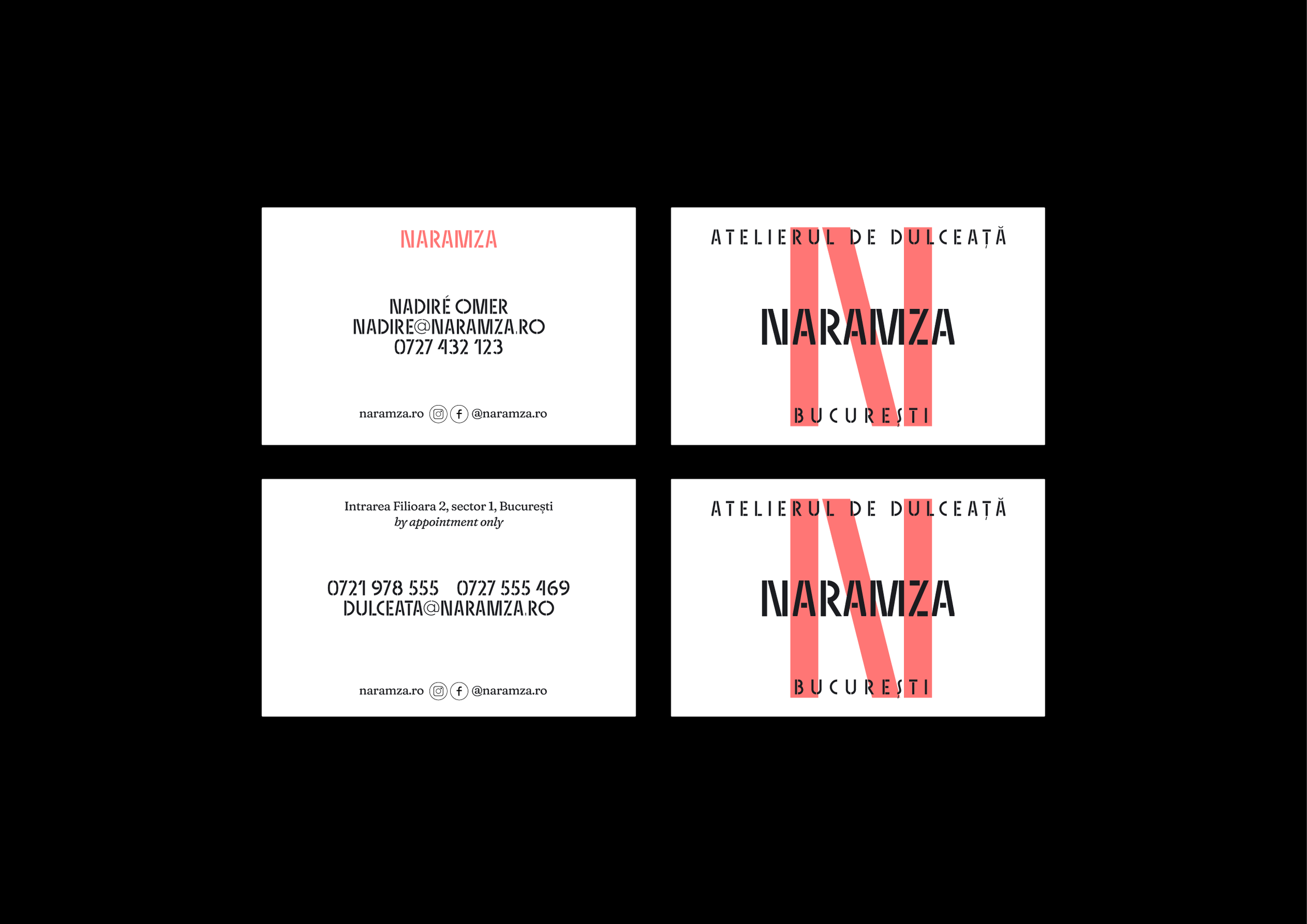
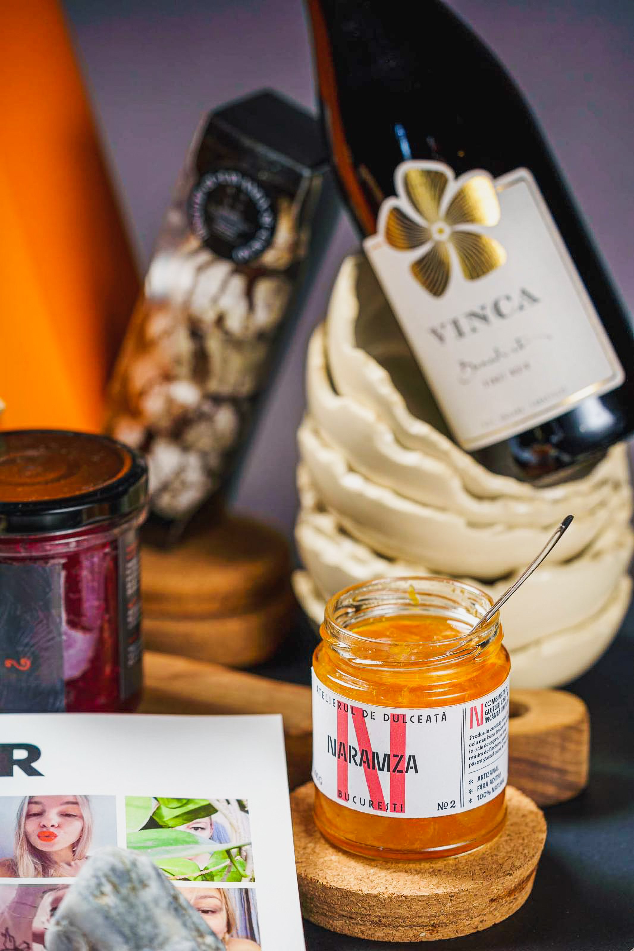
We designed this identity starting from the product and the realities of the brand. On the one hand, we had to highlight the wonderful flavor combinations, one of our pleasures being the Gin & Grapefruit. On the other hand, we had to create a very simple framework, easy to use by the founder to create a new label every time a new product is cooked. Another insight was the atelier space, set in a nice Art Deco building.
The first design idea we had was to create two front labels, instead of one. In other words, to have no back label. That way, one face is for the brand, one for the flavor, both with a maximum impact. We organized the information in a logical way and added some nice details for the taster — made in Bucharest, the flavor number and this idea of ‘N flavor combinations to delight our senses’.
Style-wise, it was clear to us that the type-based Art Deco direction was the one. Because it fits the clean sophistication of the product, it’s true to Bucharest, and the founder connects with it. Naramza by Nadiré Omer and Sisters type by Laura Meseguer is a great pairing. Celebrating the creative women of the world, this type makes the flavor combinations look even more tempting than they sound.