Welcome Q


For months now we've been working on a new identity for Quickmobile. It's really cool to work with such a young and passionate team. Last week the company launched the new mark out in the open during Internet & Mobile World Bucharest. The identity system is still a work in progress but we're excited to show you a glimpse of what we've done so far.
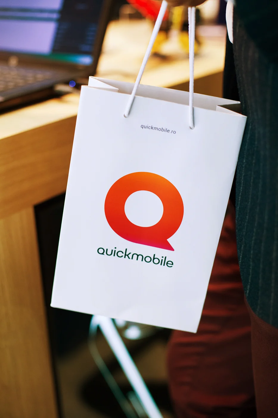
We reinvented the logo by turning the Q symbol into the hero of the identity. Simple and contemporary. It's brought to life by a bright and exciting color palette. The wordmark borrows the style of the symbol — precise, friendly and a bit cutting edge.
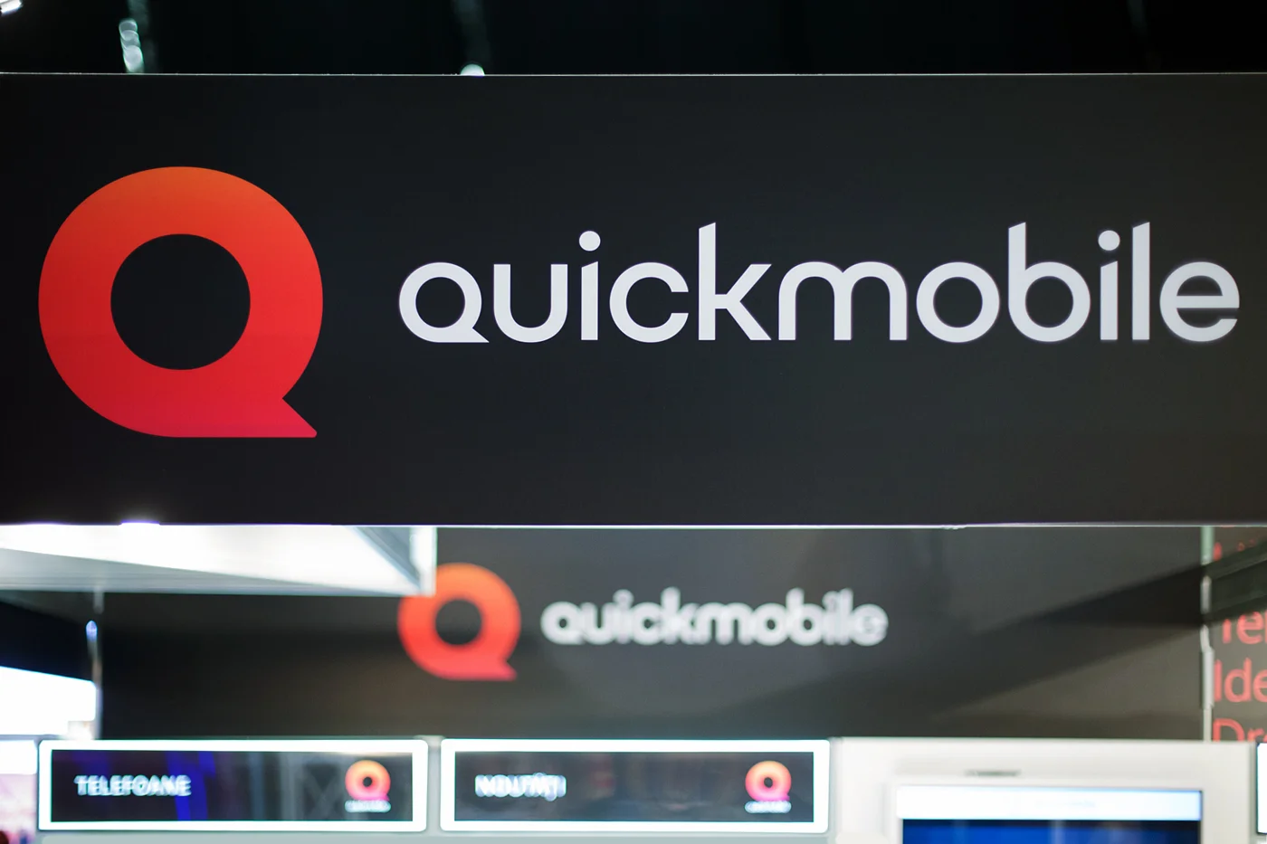
One of the subtle changes was to the name by uniting the two words into one and using "Quickmobile" instead of "QuickMobile". The Q symbol comes naturally and the logo is memorable.
We've created a mark for the future, one that will hopefully look fresh for a long time. Over the coming months, you will begin to see major improvements on the website and in the store experience.
Stay tuned for more!